Monday, March 24, 2014

By the way...

You may have noticed a lack of updates for the past while. Unfortunately my blog and I have gone on an indefinite hiatus. Even so, this site will live on so that you may enjoy looking back through the years.
For now.

Maybe someday we'll get the band back together.

Tuesday, January 14, 2014

Playing catsup

Well our new Intersession - oh, wait, I mean, "Tiger Term" -  has proven to be even quieter than I expected. That being the case, I have been able to check a bunch of things off my to-do list (and there was much rejoicing - yaaaaay). Among other things, I've sent in a proposal to a conference, made some headway with the designers of the new website, created a log detailing pretty much every outreach event that has taken place since I started this position (boy am I glad that I've been keeping up this blog), and finally finished backfilling the microgrants webpage.

Thankfully I got a little help with the microgrants from the student assistants in the main office, who I tasked with compiling title and PI information, converting all the files to PDF, and renaming and organizing the files according to a standardized directory structure. As with many projects, though, getting help is both a blessing and a burden. Although it saved me a notable amount of effort, the work was not quite done to my specifications; I already had to go back and ask for revisions once, and after that I kind of gave up and decided it would probably just be faster to finish it myself. So, adding everything to the webpage was partnered with confirming and updating nearly every entry. To top that off, as I mentioned before, organization was very poor to begin with. Many reports are missing (were they ever provided?), files were sorted into incorrect directories, some proposals and reports were not correctly associated, et cetera. Because of these issues, I still can't even be sure that this webpage is 100% exhaustive and accurate. But, it uses everything I've been provided, so I guess that means I'm finally done.

...Sort of. I still don't have thumbnails representing each awarded grant. Maybe I'll be able to task one of the new students in the main office with that (I originally asked the previous students to - twice). Though, I wonder how necessary that truly is? It may not add enough to the page aesthetically to make up for the amount of effort required.

Check out the webpage as it currently stands and let me know what you think.

Wednesday, January 8, 2014

Interns, Ready! On your mark... Get set...

GO! The 2014 Summer Intern application cycle has begun!

...Okay, so it was supposed to begin yesterday. But with "Blizzard 2014" closing RIT yesterday, I wasn't able to get it posted. Hopefully that hasn't caused too much of an inconvenience...

Anyway,

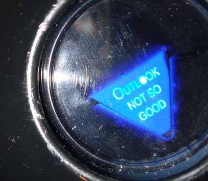
And now, I wait to see how my new online application works in practice... and how much things change (or don't?) in light of the changes to the program this year. Magic 8 Ball on my desk says:

Uh-oh. 
Good thing I'm not superstitious.

Monday, January 6, 2014

It's (pretty much) all the same to you

Who knew that my last post about snowballing would be so prophetic, what with last Thursday's 18" of snow and the impending "Blizzard of 2014" predicted for tonight and tomorrow. Nonetheless, I've been working (how nice and quiet it has been!) and have managed to complete the updates I mentioned previously to our USB drives.

Just like last time, this is all kinds of zoomed out to fit here as an image.
The most obvious change is the update to the new color scheme that incorporates varying shades of gray, and then also the updated digital booklet cover. Besides those changes, this probably looks almost identical to before - however, I actually completely rebuilt this whole menu. 

You may ask why I bothered to make significant behind-the-scenes changes, when essentially it appears like only simple updates occurred. There are a few reasons. For one, I built this menu before the class I took last quarter, which you may recall involved building websites. With that increased knowledge under my belt, I could see a lot of ways in which the html and css code could be improved so as to be more robust while also being simpler and more efficient. Secondly, there was room for improvement in terms of functionality: previously, the backgrounds behind the text were clickable, but the text itself was not. While there were several ways to fix this, all of them relatively simple, I did not truly know a good way to do it until now. So, I rebuilt the page from the ground up by hand; and although the changes may not be apparent to anyone else, I know it is overall a much better product. Plus, there will surely be more updates in the future, and this new clean code will be much easier to modify.

With all that, plus a straight forward replacement of the updated digital booklet itself, the USB is now ready to go in its new and improved state. 

Tuesday, December 24, 2013

'Tis the season to snowball

You may or may not be aware of some changes that have happened in CIS in the past 6 months. The Munsell Color Science Lab, previously housed under the umbrella of CIS, has split off and become their own lab that reports directly to the College of Science dean. In many ways, things have simultaneously changed while staying exactly the same. But anyways, functionally this meant that some of my promotional materials were now inaccurate, most notably the back panels on the brochures that include language about offering degrees in Color Science. I did not make any immediate updates at the time of the change, but now that my supply of 9-month-old undergraduate brochures is running low, it is time to make any edits before ordering more.

What started out as a seemingly simple update has since evolved into a rather significant (at least in terms of effort, if not appearance) revamp. After updating the language about CIS and switching out the HDR image on the cover, I also cleaned up some wording here and there, changed the "Features of a large university" bullet points, and updated/removed/added some logos of companies who hire Imaging Scientists. In addition to the content updates, I changed some formatting, most notably changing the ">" arrows to  , decreasing font sizes, and increasing spacing. Lastly, it was suggested that I update the color scheme to more closely reflect the new website we will have soon, which makes a lot of sense. It was a little complicated to figure out what colors to use, how to make it all fit together while remaining distinguishable, and, most importantly, how to make it look good. Although that was tricky, I am happy to say that the result is most definitely an improvement - Check it out

Meanwhile, since the point of the brochure is to whet someone's appetite enough to go check out the full online information booklet/slideshow, it became clear that that would need modification, too (not to mention that the new semester curriculum has already changed since I made the slideshow just one year ago, so the class names needed to be fixed). So, first I had to change the slide backgrounds to reflect the new color scheme (and new image that replaces the HDR one), and then I had to go through and change the text formatting to coordinate/be legible. There was a bit of time-consuming trial-and-error involved, but I think the end result is good. Luckily there wasn't a lot of content to change in this one, besides the course names, so that part was pretty simple. 

But of course, nothing is ever that easy - of course the online implementation of the booklet uses JavaScript and exported images of the slides, which all needed replacing. And since I removed a slide, the actual code needed editing as well. What was probably the most annoying part of this process was the fact that I changed my Windows system settings so that PowerPoint exports images at a very high resolution, so after exporting images of all the sides I had to also resize each and every one of them. Thankfully I set up a batch process in Photoshop to do the monkey work for me. After loading the new images and updated code to the server, the new online booklet is off and running. View it here!

ImSci info booklet cover with the new color scheme. Snazzy, eh?
Now all that's left to do (I think...) is update the version on the USB drive we hand out to prospective students. But, of course with that change, I should also update the formatting of the interface to coordinate, which is another whole ball of wax - or, I guess to be more seasonally appropriate, snow. One thing leads to another, to another, to another, and the snowball grows ever bigger...     

Friday, December 20, 2013

CIS New Website SPOILERS

Since I last discussed the new CIS website, the designers have been hard at work creating the mockup pages that would represent their proposed look and feel of the new site. I do not envy them at all for this task, as I have been told we are giving them the most complicated, detailed, and extensive website that they have yet had to build, yet we were somewhat vague on how exactly we wanted it to look. As the manager of this whole web redesign project on our end, I got a sneak peek at the new CIS website mockups a couple weeks ago - and whooo eeee are they great!!! Still, they needed a little modification before going before the larger web committee - wait, what committee?

Okay, time out. Shortly after being shown the mockups, it became clear that there were multiple people in CIS that should be at the table when it comes to providing feedback regarding design, navigation, and content. Thus far I have served as the main contact to determine general guidelines, content, layout, and a sitemap, but as we progress in the project my role will shift to overseeing a committee of diverse members that represent our various audiences here in CIS. Which really means: I will still be doing most of the work on our end, while the Wallace Center does the work on their end, but the committee will provide valuable feedback, especially in areas where I am not an expert (research groups, grad programs, etc). So, I assembled a group that includes the Director, Associate Director, Grad Program Coordinator, Ugrad Coordinator, our database manager, a couple students, and a couple other members who I know are deeply involved with students and research to comprise the CIS Web Committee. And once I got our schedules coordinated, I was able to squeeze in a meeting before break to review the updated mockups, which brings us to yesterday -

- THE BIG REVEAL! The whole committee ventured to the Wallace Center to be presented the mockups along with some explanations and descriptions of features. We were shown seven sample pages: 2 examples of the front page layout; the News database; an example news article (complete with tags!); the research landing page; an example research lab page; and two examples illustrating the new way of listing group publications on research pages, which employs both accordions and tabbed pages (pretty impressive, and apparently a new method of display not attempted before, at least not by these designers). There is no actual functioning website yet, these were merely images of layouts meant to represent what the website could look like and what features it will include.

Since I have been in on it all along I mostly stayed in the back and observed everyone else's reactions - and they were all great! The mockups were a smashing success, and the presentation led to some valuable discussions about what was shown and how to proceed. With only very slight additions/modifications, the whole committee gave their blessing - WOO HOO! This is a major step in the overall new website process.

So, what happens next? Basically, I have to keep meeting with the Wallace Center to finalize the site maps and navigation so that they can start building the site for real. As I mentioned before this is a very long process, which I would say at this point we are about half way through. Once that's completed, I will reconvene the committee so that we can make sure all our bases are covered content-wise.

Well the title of this blog post promises spoilers, so I will tease you with this: the new website employs a color scheme of gray tones and orange. The front page contains practically all of the information it currently does, but somehow does it in a really beautiful manner. I realize this isn't a whole lot to go on, so here is a tiny-size, blurred out screen shot of what it looks like:


Sorry, that's the best I can do for now; you'll just have to wait to see more! I have to retain some exclusive benefit for those of us putting in all the work...

Wednesday, December 18, 2013

"Okay, so there's the RIT website... Now show us your project."

Remember how I was building an undergraduate recruitment webpage for a class project, and then the next project required building upon that page? Well, that next project is now done - and even besides my desire to use my blog to virtually sing through the mountains about the fact that I am all done for this semester (that still feels weird to say), I figure it is appropriate to post a link to the page here since it is, in fact, incredibly relevant. And, with any luck, it will actually go live as part of the CIS website soon! So without further ado...


I put a lot of really hard work into trying to make a website that was clean, professional, and presented a lot of information without overwhelming the user. I used JavaScript to create sub-menus that separate each page's information into chunks that are visible only one at a time (I think this is pretty cool and surprisingly sophisticated for what I thought I was capable of). And, I like the overall look and feel. Obviously I'm no professional design team, but I am pretty darn proud of what I've learned and accomplished over a single semester. I hope you like it. (At least my professor does... the title of this post is actually what he said when I presented my project in class!)

As always, if you have any feedback or suggestions, please feel free to comment!